The dashboard displays the most commonly used maintenance performance indicators (KPIs – Key Performance Indicators) along with a selection of statistical modules.
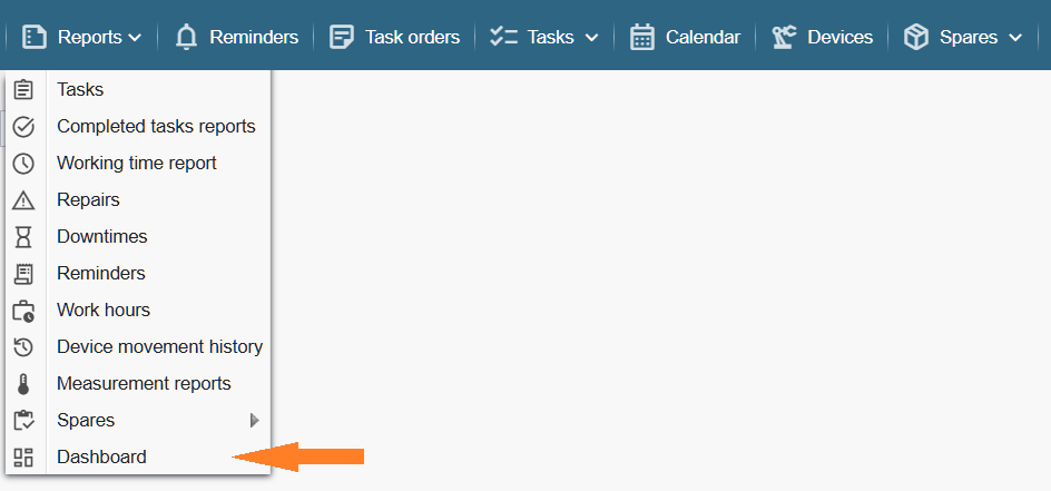
The dashboard can be accessed via the menu Reports > Dashboard.
Note: Viewing the dashboard requires the appropriate privilege (Settings > Users > Groups > … selected group … > Reports > Dashboard).
If desired, the dashboard can be set to open automatically when the application starts. To enable this, click your name in the upper‑right corner, select “My profile,” and activate the option “Open dashboard on page load.”
Performance Indicators (KPIs)
Each indicator tile displays the current value in the upper‑right corner (based on today’s data) and shows a trend indication reflecting changes over the past year.
The indicators are updated once every 24 hours.
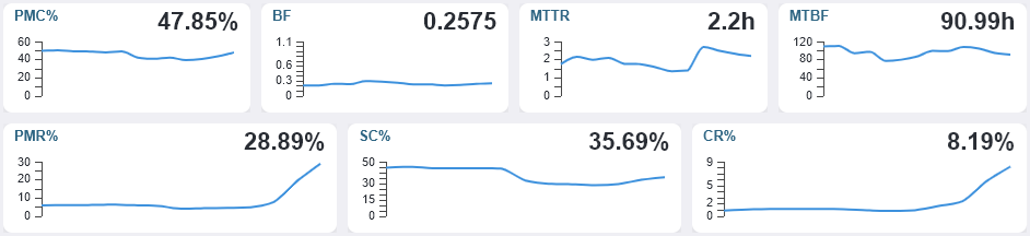
PMC% – The percentage of maintenance tasks completed on time within the last 365 days (Percentage of scheduled Maintenance tasks Completed on time).
The indicator ranges from 0 to 100%. A higher value indicates a better result.
Formula: ( Regular + Planned tasks completed on time or earlier ) / ( Total number of Regular + Planned tasks ) × 100
BF – Breakdown frequency calculated over the last 365 days (Breakdown Frequency).
Shows the average number of breakdowns per day. A lower value indicates a better result.
Number of corrective (unscheduled) work orders / 365
MTTR (h) – The average time spent on repairs based on data from the last 365 days (Mean Time To Repair).
Shows the average time spent on a single repair, measured in hours. A lower value indicates a better result.
Formula: Total duration of corrective (Extraordinary) work in hours / Number of extraordinary tasks.
MTBF (h) – The average time between failures, measured in hours (Mean Time Between Failures).
Shows the average time in hours between failures. A higher value indicates a better result.
Note: Ideally, the calculation should be based on the actual equipment uptime in hours. Since this information is not available, a simplified approach is used: we take 365 × 24 hours as the baseline and subtract the total repair duration from it.
Formula: Devices uptime in hours / Number of extraordinary tasks.
PMR% – The ratio between planned and actual maintenance duration (Planned Maintenance Ratio).
Shows how accurately the duration of maintenance tasks has been planned. The closer the value is to 100%, the more precise the planning has been.
For example: 25% means that only 25% of the maintenance time was planned in advance, while 75% was spent unplanned, which is undesirable. A value above 100% indicates that more time was planned for maintenance than was actually needed.
Formula: Planned maintenance duration in hours / Actual maintenance duration in hours × 100
SC% – Percentage of adherence to the planned maintenance schedule (Schedule Compliance).
Shows how well we adhere to the planned maintenance schedule. If all regular tasks are completed on time, schedule compliance is 100%.
Formula: Regular tasks completed according to schedule / Total number of regular tasks × 100
CR% – The proportion of working hours spent on corrective (extraordinary) maintenance compared to the total number of working hours (Corrective maintenance Ratio).
Shows what percentage of the maintenance team’s working time is spent on corrective (extraordinary) tasks related to breakdowns. A lower value indicates a better result.
Formula: Corrective maintenance man‑hours / Total maintenance man‑hours × 100
Statistics Modules
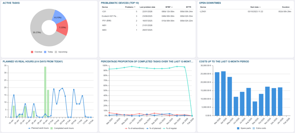
Active Tasks – A relative chart displayed on the application’s home screen. The red segment shows overdue tasks that have not been completed on time. The blue segment represents tasks scheduled for today. The grey segment indicates upcoming tasks planned for the next few days (14 days by default).
Problematic Devices TOP10 – The ten devices that have had the highest number of corrective (extraordinary) tasks (failures) during the past 365 days.
Open Downtimes – Devices for which an active downtime has been registered (the downtime end time has not yet been set). Note: This module is visible only when the downtime registration functionality is enabled.
Planned vs Actual Working Hours (±14 days from today) – The chart displays the number of working hours planned for each day compared to the hours actually spent. Planned hours are shown as a blue line, while actual hours are represented by green bars. The centre of the chart marks the current day, and the bar for today (actual hours) is displayed in blue. No green bars appear to the right of today, as future actual hours do not yet exist.
Percentage Proportion of Completed Tasks Over the the Last 12 Months period – The chart displays the monthly percentage ratio of Extraordinary, Planned, and Regular (preventive) maintenance tasks over the past 12 months.
Costs for the Last 12 Months – Displays the expenses related to spare parts and additional services/costs over the past 12 months.